


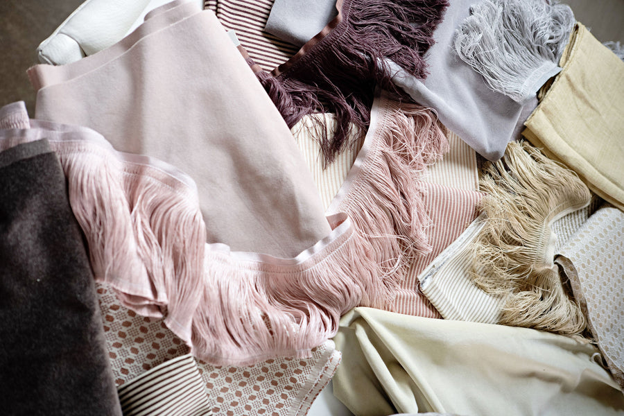
The Ivy Ottoman
- 22.5" Width
-
Ringo, Bay

-
Linen Stripe, Natural

-
Rattan, Stone

-
Rattan, Rose Quartz

Starting at $825.00
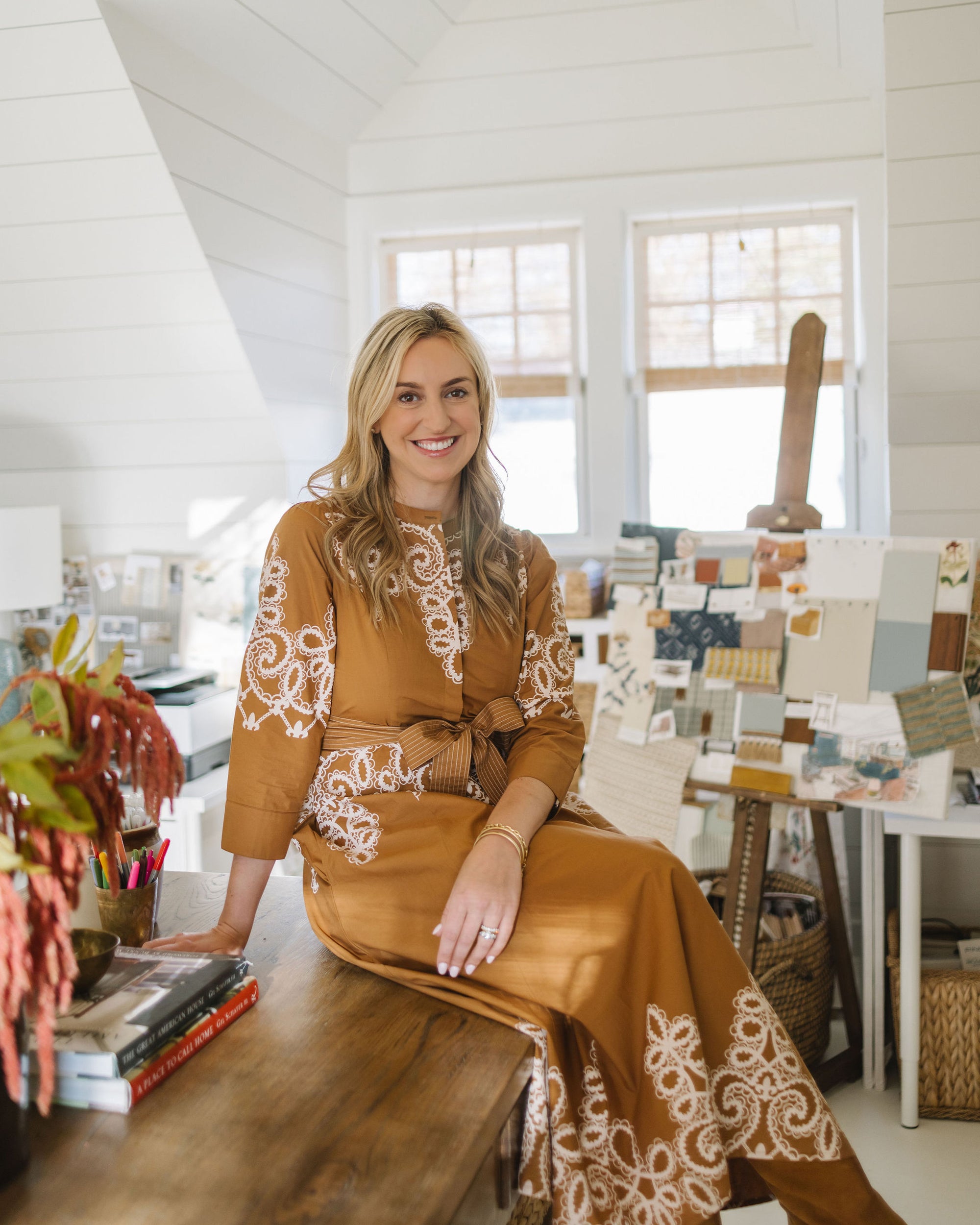

We love seeing what she designs for her clients and how she makes each space truly unique. Read on to learn more about Catherine and how she designed her Coley Home pieces.
My love for design dates back to when I was a little girl. I grew up in Arlington, Virginia, where my mom was an interior designer. She would work at her drafting table, and I would pretend to draw floor plans next to her at my miniature drafting table. I’d tag along with her to the office in Georgetown, antique shops, and designer showhouses.
Somewhere along the way, I thought I wanted to be a news anchor, so I attended the University of Georgia and received a degree in Broadcast Journalism. I quickly discovered that this was not my calling and realized I was meant to follow in my mom’s footsteps and work in interior design.
I was hired by Carter Kay Interiors, where I worked for almost six years. I was so fortunate to learn from Carter and to live just a few blocks from ADAC, with all the design showrooms at my fingertips. I moved to Nashville in 2019 with my husband Austin (a native Nashvillian) and began working for Rachel Halvorson Designs.
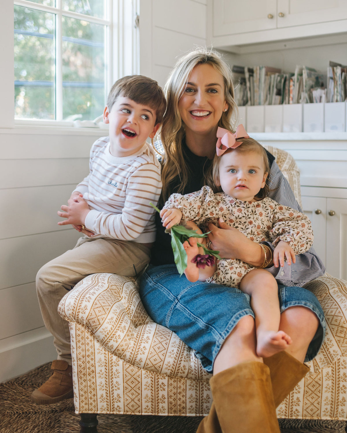
After our son Charlie was born in 2021, I started my own business and haven’t looked back since. We had our daughter Lily in 2023 and—well, life is busy, to say the least. :) It can be hard to juggle it all in this season, but I feel so blessed to have two healthy, beautiful children, a supportive husband, and wonderful clients.
Without fear! I’ve been specifying paint colors I never imagined—rosy pinks, sunny yellows, and berry reds, just to name a few. I think the key is using bold colors, patterns, and wallpapers in places that call for it.
Without fear! I’ve been specifying paint colors I never imagined—rosy pinks, sunny yellows, and berry reds, just to name a few. I think the key is using bold colors, patterns, and wallpapers in places that call for it.
Short answer—no! My design process usually begins with a “wow” fabric we love (i.e., the fun pattern or print that will be the star of the show). Then we build the other fabrics, paint colors, and finishes around it.


The Lola Swivel Glider in Ticking, Rose Petal (Discontinued - Pinstripe, Shell is close alternative)
In an ideal world, I select the fabrics (or at least the main one) before choosing paint colors. In most cases, a mix of pattern, scale, color, and texture makes for a more interesting room. But lately, I have been wanting to use a coordinating fabric and wallpaper so the entire room is drenched in one pattern.
So, it goes to show—there really isn’t one hard-and-fast rule. It depends on what my client is loving, what mood I’m in, where I’ve just traveled, or even the season. I work hard to create spaces that feel truly unique to the client, incorporating pieces they love and that feel like their home—versus one “Catherine Branstetter signature look.”


The Crown Bed - Charlotte in Rattan, Rose Quartz with Como, Kelly Green Welt and Simply White Finish
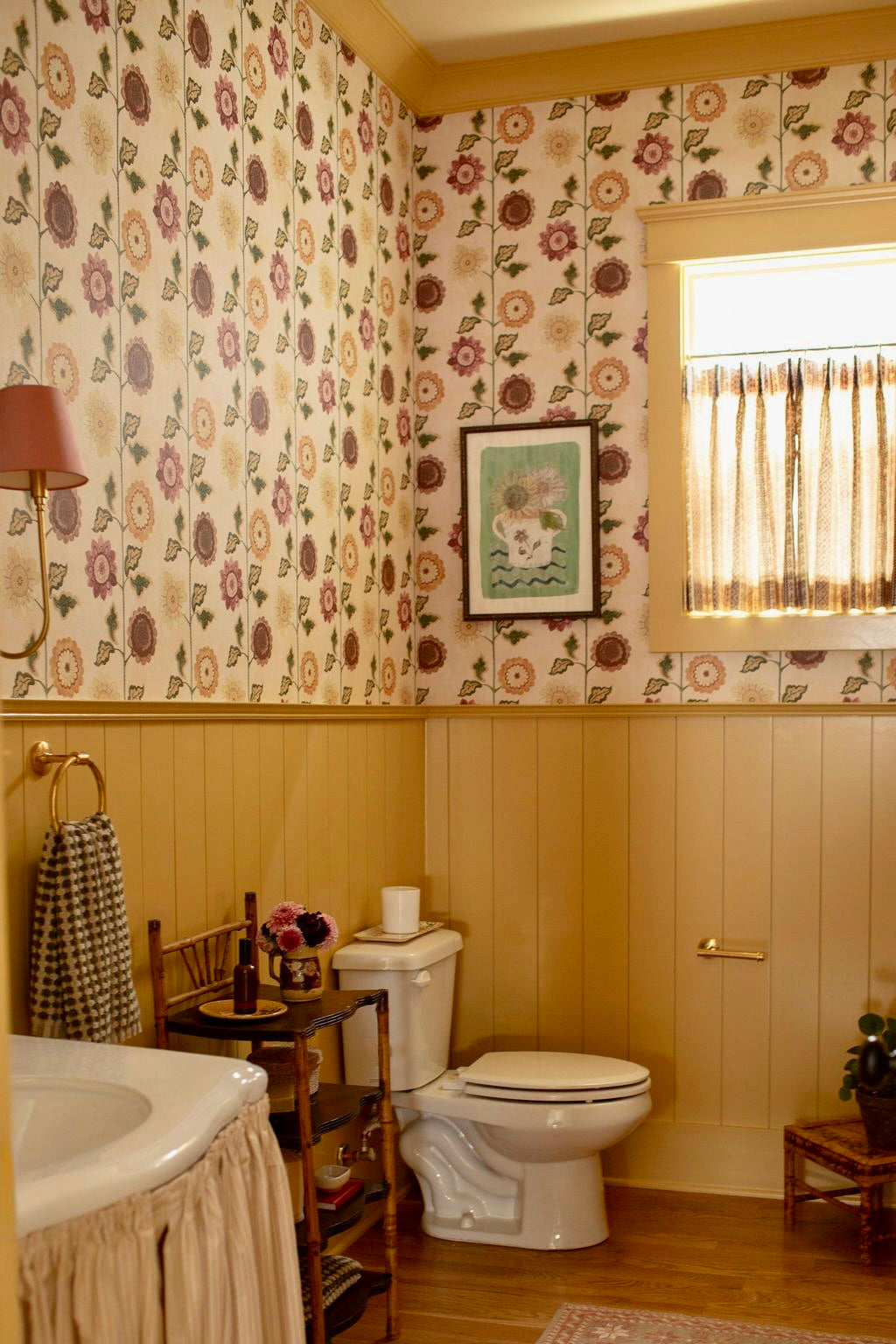
Ah yes—so many! I just used Studio Humbug’s Horticulture in Moss wallpaper in a client’s powder room, and it turned out so fun! We went with Farrow & Ball’s Sudbury Yellow on the trim and planking, and it is such a happy space. Is it weird that I want to hang out in that bathroom?! I’ve really been loving yellows at the moment.
I also really love Schuyler Samperton’s Caledonia fabric and wallpaper pattern. I’m planning to use the Grasshopper Green colorway in a client’s bar.
Travel, always! I come home from trips feeling so inspired. For me, it’s as much about being in a new environment as it is about unplugging. I’m glued to my laptop at home, but when we go on vacation, I try not to open it and instead read design magazines. It’s a great way to hit refresh and return to the office excited about scheming up the next project.
My husband Austin and I traveled to the Amalfi Coast in May, and it truly feels like a postcard. Our hotels—Palazzo Avino in Ravello and Punta Tragara in Capri—were incredibly inspiring. Figuring out where to stay is my favorite (and arguably most important!) part of planning any trip.
We also just returned from Nantucket with our kids, and the island (along with most of New England) is loaded with charm, beauty, and inspiration. This was our fourth summer on ACK, and I always leave wishing we could stay longer. I could bike around the cobblestone streets lined with shingled cottages and climbing roses all summer long. There’s something magical about the island—the design aesthetic and the whole vibe really speaks to my inner “Nancy Meyers / coastal grandma” persona.
I almost always include something rattan, bamboo, or tortoise in the spaces I design. I love incorporating natural elements, and rattan has always been a favorite.
That, and a stripe! It’s rare for a stripe not to make its way into one of my schemes. My four-year-old says my favorite color is “blue and white stripes.” :)


The Ivy Ottoman in Linen Stripe, Shell - Vertical with Linen Fringe, Moonstone
Splurge: Antiques and art! These are the pieces that make a room shine. If a piece of art speaks to you—buy it! You’ll always find a place for it. Same goes for antiques. You know those “one that got away” antiques that still haunt you? There’s nothing worse! A pretty antique you love should go home with you.
I also think clients are often surprised by the cost of custom drapery (if they haven’t done them before). But there’s no question they complete the room—and they’re worth it once installed.
Save: I think it goes without saying that kids’ rooms and playrooms don’t need the most expensive fabrics, lighting, or rugs. I have a two- and four-year-old, so we’re hard on furnishings these days. Luckily, there are so many great, affordable sources out there for these spaces—think Pooky Lighting, Schoolhouse, and of course Coley Home for upholstery
Good wine, good friends, and a husband who can cook — that’s my kind of recipe! :) I’m more into setting the table than cooking the meal, but I recently hosted a pink-themed dinner for my girlfriends in honor of my mom and Breast Cancer Awareness Month. For me, the best recipe is always the one that brings people together.
Drink-wise: A glass of Sancerre or Pinot Noir is my go-to, but “Attitude” Sauvignon Blanc is another favorite. And after a long week? An extra dirty martini with blue cheese olives.


Starting at $825.00

Starting at $1,880.00
Starting at $1,815.00
Starting at $595.00
Starting at $2,265.00
New
Starting at $2,130.00
Starting at $825.00
Starting at $1,880.00
Starting at $1,815.00
Starting at $595.00
Starting at $2,265.00
New
Starting at $2,130.00
Receive inspiration, product announcements, and special offers.
Thank you! You've been subscribed.

Interior designer Ariel Okin redesigned the Roller Rabbit flagship locations to create charming, vibrant spaces that reflect the brand’s playful energy. She used our pieces to complete both stores, and we’re absolutely in love with the results! Explore the products Ariel and her team used, and get inspired to dream up your own Coley Home piece. Design by Ariel Okin Interiors | Photography by Julie Leffell | Styled by Abby Ward Sit & Stay Awhile Ariel chose our Baxter Corner Banquette to anchor this cozy seating nook, creating a chic and comfortable resting spot for tired shoppers. Our custom banquettes are custom-by-the-inch and available in several elegant silhouettes, so you can create the perfect piece for every space! Dress It Up Ariel used our Eleanor Benches to make these dressing rooms functional & chic! We love the dressmaker skirt on this piece, making it perfect for adding a touch to sophistication. Shop the pieces featured in the Roller Rabbit stores or start designing your own custom Coley Home piece today! The Baxter Corner Banquette The Eleanor Bench
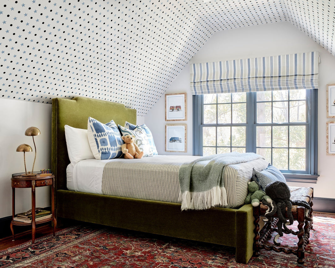
Meet Cate Gutter, the founder and principal designer of CWG design. Cate recently had the opportunity to design an entire home, and she featured Coley Home in several spaces! She gave us insights into her thoughtful design process and shared that true cohesion of a designed home comes from the people who live there. Read along to learn more about Cate's design process and how she styled Coley Home pieces in her recent project! Tell us about yourself & how you got to where you are today! I’m Cate Gutter, founder and principal of CWG Design. As the daughter of a house flipper, I learned early that home isn’t just a place, it’s a feeling. The best ones are layered, lived-in, and deeply personal. My path into design wasn’t typical; I built my firm organically through relationships, intuition, and a genuine curiosity about how people actually live. Five years later, my firm has evolved into a full-service design studio creating homes that feel thoughtful and warm, tailored but relaxed, timeless yet unmistakably personal, always grounded in a strong sense of place. You recently selected a Baker Bed in Mohair, Herb for a playful yet sophisticated boy’s bedroom. Walk us through the design process! The room began with the architecture; that sloped ceiling felt like it was asking to be wrapped in stars — perfect for dreaming (day or night). The Schumacher wallpaper felt whimsical from the start, and interestingly, even on the ceiling, it grounded the space rather than overwhelming it. The Baker Bed in Herb Mohair was the perfect complementary color. It has depth and quiet confidence without feeling loud, and the mohair adds softness and texture that instantly elevates the room. In a space with pattern overhead, we wanted something solid and tailored to hold it all together. From there, it was about balance. We layered in classic elements with a vintage rug, the striped Roman shade, and an antique side table. Then we let the personality show up in smaller moments: playful art, layered pillows, collected accessories. I always want a child’s room to feel like it truly belongs to them, but not in a way they’ll outgrow in two years. The bed is the investment piece. Everything else can evolve around it as he does. The Baker Bed Do you have any tips for designing a kid’s room? How do you find the balance between fun and functional? As a mom, I’ve seen how quickly their interests shift, but also how deeply attached they become to the spaces that feel like theirs. I like to anchor the space with pieces that have staying power: a well-made bed, a wool rug that adds comfort (and is forgiving to clean), and nightstands or dressers that can grow with them. Then the fun comes through the layers with art, textiles, whimsical wallpaper, and perhaps something a little unexpected. Those are the elements that can shift as they do. Function matters, but it doesn’t have to be boring. Storage should feel thoughtful, fabrics should be durable, and the layout should allow space for both rest and imagination. The balance really comes down to restraint. Let it feel playful, but ground it in pieces that give the room longevity. A child should feel at home in it, not like they’ll outgrow it next year. For this project, you were able to design the entire home, giving each room distinct personality yet giving the home a cohesive feel. What is the most important factor to create cohesion throughout a home? Cohesion starts with intention. When we design an entire home, we’re thinking about the feeling first, long before we’re thinking about individual rooms. Every space should have its own personality, but there needs to be a quiet thread running through it all. Maybe it’s a warmth in the palette, a texture or color that repeats, a certain level of contrast, or simply a shared mood that carries from room to room. But true cohesion comes from the people who live there. Our clients’ personalities shape everything, from the art they’re drawn to, to the books and objects that fill their shelves. Those personal layers are what make a home feel honest and connected rather than styled for a photograph. Restraint plays a big role. Not every room needs to be the moment. When you edit thoughtfully and allow materials or tones to reappear in subtle ways, the home begins to feel layered and lived-in instead of overly designed. To me, cohesion isn’t about sameness. It’s about rhythm, flow, and a home that feels grounded in its place and in the people who call it home. The Teeny Counter Stool You used Shiitake Ottoman in Cashmere, Fawn in another bedroom in the house. What are your favorite ways to mix textures and patterns into a space? With its soaring vaulted ceilings, this bedroom marked a transition into a true “big girl” space. She had her heart set on a fairy room, which we interpreted in a way that felt imaginative yet enduring. We layered in whimsical details with fairy knobs on the Crate & Kids dresser, a wood canopy bed dressed in playful fabrics, and a custom hand-painted mural that brings the entire room to life. Louisiana-based artist Liz Russell flew in to create the mural over several days, painting a blooming garden complete with a tiny mushroom house fit for a mouse. It feels magical, but still grounded. The Shiitake Ottoman in Cashmere in Fawn fit right into that story. Its soft, organic tone subtly echoes the mushroom motif in the mural, while the cashmere adds a quiet refinement that keeps the room from feeling overly themed. I love when a piece can nod to the narrative of a space without being literal, it makes the design feel layered and thoughtful rather than costume-like. The shiitake ottoman Cate also used our Lindy Swivel in COM (Customer's Own Material) and we love the way it turned out with the Shiitake Ottoman! The Lindy Swivel What design trends are you forecasting in 2026? I think 2026 will continue moving toward warmth and individuality. We’re seeing richer, more nuanced color palettes, layered textures like mohair and cashmere, and natural materials that feel collected rather than overly styled. There’s less interest in stark minimalism and more desire for spaces that feel personal and lived-in with homes that reflect the people who live there, from the art on the walls to the books on the shelves. It’s less about chasing trends and more about creating rooms with depth, intention, and a real sense of place. What is your favorite hostess gift? I tend to gravitate toward hostess gifts that feel personal and meaningful, so I don’t really have one classic go-to. When I travel, I love bringing something back from Charlotte, a Queen Charlotte candle from R. Runberg is always special and feels like a thoughtful nod to home. If we’re going to dinner, I’ll often bring a bottle of wine my husband and I have collected during our travels, something we can open together and share the story behind. For a more casual cocktail gathering, I might bring one of Reid’s snack mixes or a jar of local honey. I love gifts that feel connected to a place or a memory — something simple, but intentional. Are you currently binge reading/watching anything? I laughed out loud when I saw this question because it’s a running joke among my friends — and the CWG team — that I’m usually off in a faraway fae land or watching a blushable series on Netflix. Contrary to what some may believe, I do pause for a great documentary or nonfiction book — but more often than not, I fully embrace indulgent escapism. And of course, the new season of Bridgerton delivers — dramatic storylines, over-the-top costumes, and sets so beautiful they almost steal the show. Sometimes you want depth. Sometimes you just want decadence. Thank you, Cate!
Meet Jamie Kirkman, founder of Jamie Kirkman Interiors! Jamie takes a pragmatic and creative approach to her designs, incorporating custom furnishings, special collections, and curated art. With over 25 years of experience, Jamie has perfected her design techniques and was recently featured in the Atlanta Home For The Holidays Show house. She featured Coley Home chairs in the dining room and we are obsessed with how they turned out! Read on to see how she styled her Coley Home pieces in the show house. Tell us about yourselves & how you got to where you are today! I've always been drawn to creating spaces that feel both beautiful and lived in, and my path into interior design began through hands-on learning and mentorship. Today, my approach is all about understanding my client and their personalities, how they move through their homes, and what matters most to them. I believe the best design reflects who you are while elevating your everyday life. I feel incredibly fortunate to do work I'm passionate about alongside clients who trust me with their most personal spaces. You recently selected (6) Evans Dining Chairs in COM with Mont Blanc, Blush Welt, and Bleached Oak Finish, as well as (2) Evans Dining Chairs in Miller, Taupe with a Mont Blanc, Blush welt, and Bleached Oak Finish for your Dining Space in the Atlanta Home for the Holidays Showhouse. Walk us through the design process! The lines of the Evans chairs were exactly what I wanted for the showhouse dining chairs. We then selected fabrics that could stand out against other beautiful features in the room while complementing the chairs' style. The geometric pattern on the COM chairs worked perfectly with the small scale of Miller Taupe, while the Blush Welt tied the chairs together to create a cohesive design. The Evans Dining Chair - COM The evans dining chair - Miller, Taupe with a Mont Blanc, Blush welt Do you have any tips for selecting the perfect COM for a space? When choosing COM fabrics, I focus on the room's function first, selecting options that are both beautiful and durable enough for daily use, helping clients find something they truly love and that suits their lifestyle. How would you describe your style? I'd describe my style as refined organic luxury. I love layering natural elements like wood, stone, and greenery with sophisticated details like brass fixtures and sculptural lighting. I aim for spaces that feel both curated and livable, while reflecting the client’s personality and lifestyle. What is the most important detail when designing a dining room? Lighting is everything. It sets the entire mood for gathering and entertaining. Beautiful ambient lighting that makes everyone look and feel their best. The table should allow for comfortable conversation with chairs that are comfortable enough that guests actually want to sit in for hours, and the overall space should encourage people to linger and feel the atmosphere. What is your favorite space that you have designed in your personal home? I love our primary bedroom. It's calming and restorative, designed as a true sanctuary with minimal furnishings and a soft, soothing palette. What are your go to places for inspiration when designing a new space? I love flipping through design books and following European interiors on Instagram for fresh perspectives. What is your favorite coffee table book? John Derian Picture Book There's something about his eye for beauty in the overlooked that really resonates with me. Thank you, Jamie!

Meet Caroline! Based out of Raleigh, NC, Caroline creates the most incredible artwork, from intricate paintings to delicate sculptures. Read on to learn all about Caroline and how she styled her Coley Home pieces. Tell us about yourself and how you got to where you are today! Hey Coley Home! I am Caroline Reehl Boykin, a fine artist based in Raleigh, North Carolina and my work is inspired by the spirit of everyday life. For the past 15 years I have had the honor of creating artwork for clients all over the world. My paintings are filled with elements of nature, architecture, and form using many mediums. I find that unique color interactions within my paintings capture viewers and bring them into a conversation of life and movement. Through the use of porcelain, acrylic paint, and gold and silver leaf, I paint multi-dimensional works that transcend a subject and allow the viewer to decipher meaning. I have always loved to create. My childhood on the Alabama coast cultivated my enchantment with art and southern culture. Touches of this admiration for Southern hospitality and grandeur are seen today flowing through my paintings. While in college, a summer of studying figure drawing in Florence, Italy led me to the realization that being an artist was in my bones. I earned a Bachelor of Fine Arts degree from the University of Mississippi (Hotty Toddy!!) where I focused on ceramics, but I have always had a true passion for all mediums in art. Today I am blessed to have my studio right here in my home so that I can jump between businesswoman and momma easily. My husband, two girls, and bulldog, Blue, provide me with as much support as they do inspiration to my paintings! Caroline's Website How would you describe your artistic style in your own words? My work is rooted in the rituals of everyday life - morning light, the scent and shapes of flowers from our garden, my girls' infectious giggles, or an ice-cold martini my husband makes me after a long week. These moments are sacred rhythms woven into my paintings. I think my artistic style is a nice combination of Modern and Feminine. How do you approach mixing color and texture in your pieces? Color and texture are such important aspects of my work! In my Le Pointe collection, mixed color combinations are the foundation and the starting point of each painting. Once the squares of color are chosen for the painting, I then come back with more colors but in small marks to create a dance between the squares. When mixing the paint for these marks, I whip my paint to a frosting-like consistency to create little dots of texture. This mesmerizing texture creates the smallest shadows that move throughout the day as light moves across the painting. Caroline used a pair of Bongo Stools in COM (Customer's Own Material) to create the perfect accent pieces for her living room! Where do you personally look for inspiration? Everywhere! Small and simple moments inspire me most as of late. There is beauty surrounding us always, we just have to take the time to find it. This is what I want the viewer to feel when taking in my artwork. To admire the painting with an exhale and to get lost in a memory. I find myself within each scene of my Pout paintings. Do you have any tips for mixing art with furniture and decor in a room? My only tip is to purchase art that you love, and not just because it matches your couch! I find a home much more inviting and beautiful when it is filled with interesting art. What are your favorite areas to splurge when decorating your home, and favorite places to save? My favorite places to splurge and save are the same - antiques! Sometimes you find the save of the century in an antique chandelier or the biggest splurge in an antique Klimt sofa. Whether a splurge or a save, antiques are always necessary. Is there anything more fun than the thrill of the hunt? Most treasured piece in your home (besides your own art)? We have the cover of my great grandmother's bible framed and hung in our kitchen. My great grandmother Leavie, whom my oldest is named after, was born in the late 1800s and I inherited her bible which was so loved and used that it was held together by duct tape. We (very carefully!) took off the cover that is inscribed with her name and framed it in a gorgeous antique frame. It brings me so much joy to see it every day, a sweet reminder of my beloved family and what a matriarch looks like. What is your favorite spring or summer recipe? Food or cocktail! So many! We love to eat in my house! In the spring and summer, it’s anything made with in-season produce from our local Farmer's Market. We also love a skinny Piña Colada for a fun cocktail/mocktail around the pool. It's just blended coconut water, a little pineapple juice, pineapple chunks, and ice. When my girls aren't partaking, a splash of rum makes it even tastier! Thanks, Caroline!
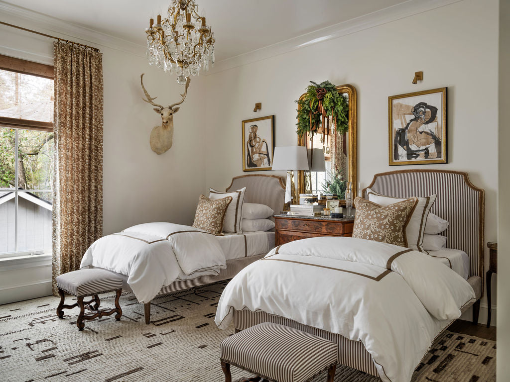
Meet the creatives behind Huff Harrington Design! Recently featured in The Atlanta Home For The Holidays Show House, we adore their fresh yet traditional spaces. They masterfully blend the old with the new and we love following along to see what they're designing next. Read on to see how they styled their Coley Home piece in the show house. Tell us about yourselves & how you got to where you are today! Trudy was born and raised in Piqua, Ohio, though people are often surprised I’m not a born and bred Southern belle. I currently lead Huff Harrington Design as Lead Designer, where I bring a refined design sensibility, thoughtful approach, and a little optimism to every project. Before fully stepping into interiors, I honed my spacial design skills through l leadership roles with brands including Gap, Spanx, and Serena & Lily. Frequent trips to France – where I assist with international design projects and installations – have shaped my signature approach: blending old and new with a playful, unexpected twist. Outside the office, you’ll often find me strolling Chastain Park with my handsome Lab, Beau, or enjoying a lively dinner out with my husband, glass of bubbly in hand. Emma Caroline Lee has spent years with Huff Harrington honing her eye through countless design projects. Prior to that she tackled the world of luxury PR launching fine art, fashion and hospitality brands in Atlanta. While her heart lies with traditional themes she loves to create a mix and to elevate designs through fabrics and custom pieces, building a story around our clients’ existing furnishings. Her love of classic and traditional design is a perfect complement to the Huff Harrington mix of antique and modern. When she’s not designing, you can find her spending time with her adorable young family or traveling. One of the most meaningful parts of our work is connecting with clients. We take the time to really listen, understand their stories and the pieces they love, and translate their vision into spaces that feel personal, sophisticated, and always chic. You recently selected 2 Twin Claremont Beds - Charles with a fabulous brushed fringe. Walk us through the design process! One of the elements that grounded the design of the room from the very beginning was a fabulous imported antique settee we found in the South of France. Its sassy curves immediately set the tone, so it was important for us to find bed frames that echoed that curvy softness – the Charles did just that. As with any successful space, the devil is in the details. We had the most fun marrying the bed frames and settee through coordinating fabrics - ultimately choosing a stripe for the beds to bring in a tailored note. To soften the structured stripe - and of course adding a touch of unexpectedness - we finished the headboards with a brushed fringe trim from Samuel & Sons. Layered against the Farrow & Ball high-gloss walls, the subtle movement and texture was the perfect final touch, elevating the beds while tying the entire room together beautifully. The Claremont bed - Charles How would you describe your style? Classic at its core, with a deep reverence for both contemporary and antique influences. You have a design branch in both Atlanta and Paris. Do you often try to incorporate European influences throughout your design projects in the US? It truly works both ways – we’re constantly inspired by both sides of the pond. That said, there’s something especially compelling about incorporating a piece of French history into our state-side projects. A beautiful European antique has an effortless way of adding depth, soul and a bit of “crunch” when layered into a modern or traditional home. We always aim for a home that feels classic and lived-in. If you had to pick one, what is your favorite project to date? That’s a difficult question, as each project is deeply personal to each client. Knowing their story, understanding the heirlooms they cherish, and creating designs that reflect their lives make every project meaningful in its own way. What aspect of Parisian lifestyle do you adopt in your everyday life? I’ve always admired the ease of the French lifestyle – lingering over meals, choosing quality over quantity, and treating everyday rituals as small indulgences. And of course, there’s the skincare… a daily reminder that a good cream can, in fact, solve almost everything! What’s a wallpaper or fabric you are dying to use in a project? Tough question because there are so many that are on our radar but I recently stumbled across the most adorable wallpaper by Jordan Connelly that would be the perfect addition to a family vacation home. Favorite coffee table book? Well, at the moment , we are gushing over the most recent Atlanta Homes & Lifestyle magazine because Huff Harrington Design made the cover! What is your most requested design feature? ‘The Mix’ of new & old The mix – layering new with old to create spaces that feel collected, not decorated. It’s about balancing contemporary pieces with character-rich antiques to achieve spaces that are timeless, personal, and truly lived-in.


